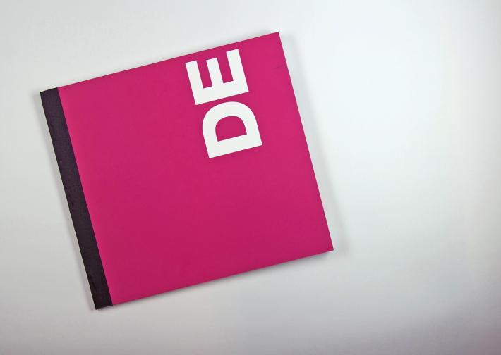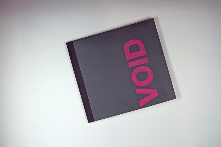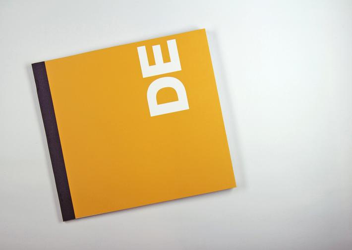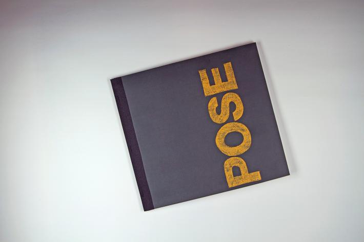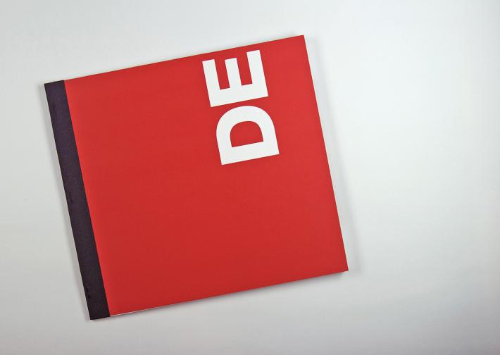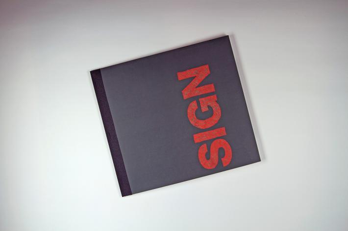
DEmote, DEvoid, DEpose, DEsign
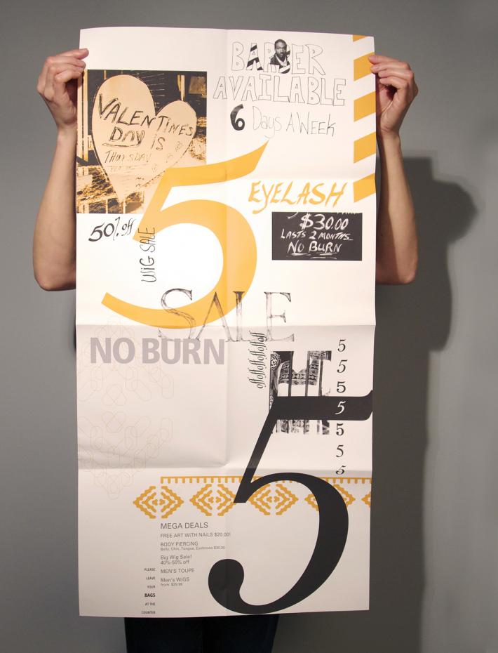
Chalkboard lettering and hand drawn signage embody the ephemeral quality of vernacular design. This design vocabulary is wonderfully naive, unashamed of it’s crudeness and questions what the trained eye deems to be acceptable.
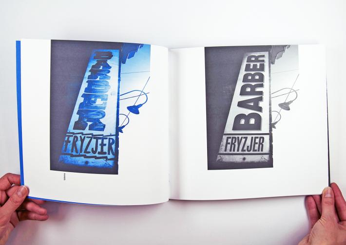
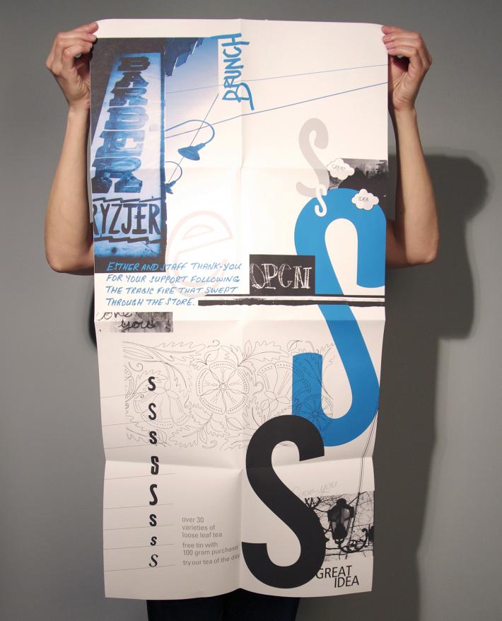
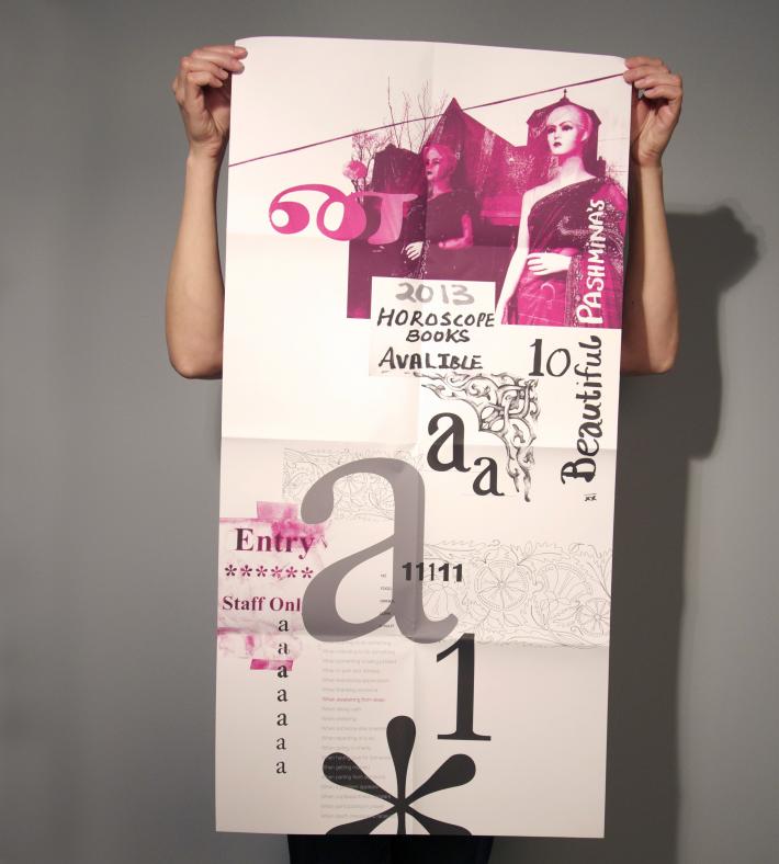
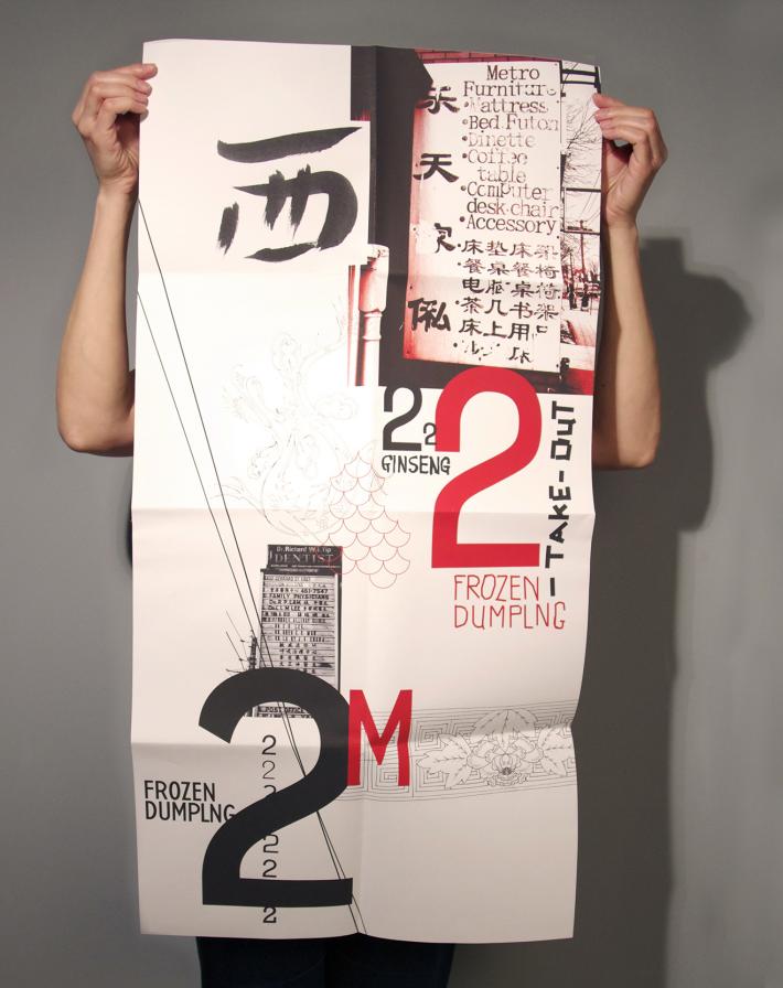
My second studio project during my York University Masters Program was my exploration into the vernacular and it’s possiblities for use in graphic design. I went to 4 communities in Toronto – Roncesvales, Little Jamaica, Little India and China town. Through 4 posters I looked at what media is being used and how it is being applied to various surfaces and I how I could reinterpret these voices in my posters and partner the vernacular with the practiced.
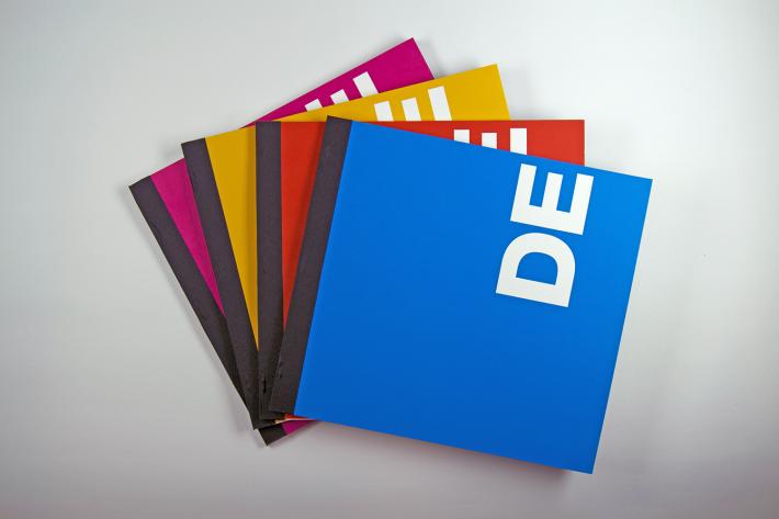
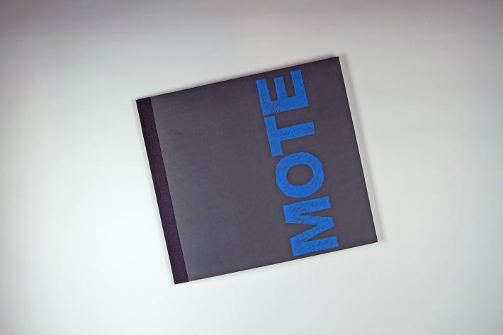
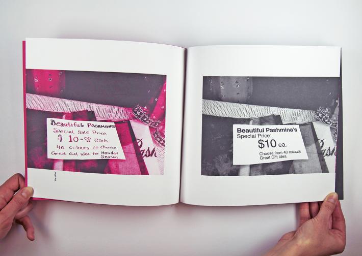
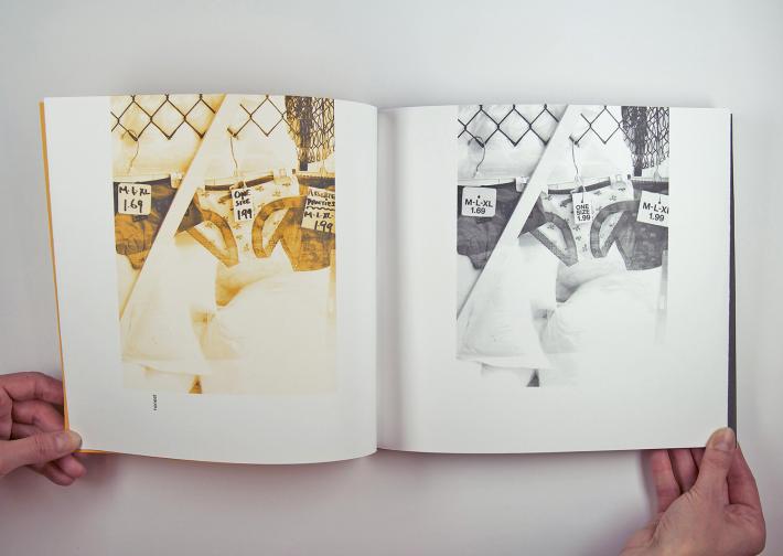
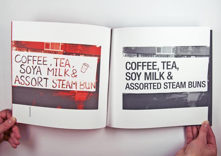
I made 4 books to house the posters and titled them DE sign, DE pose, DE void and DE mote. The books show the vernacular on one side of a spread and it stripped away, replaced by Helvetica, on the other side. This exercise was a way for me to grasp how vernacular adds personality and a sense of belonging to individual neighbourhoods. How the different cultures are reflected in their vernacular. And how vernacular is not seen as precious.
Reflection on this project made me aware of the fact that I was looking to others for inspiration – unable to connect my own vernacular methods to my design practice.
~Masters of Design Studio with David Cabianca – Project 2
This project lead to a series of screen printed tea towels which can be seen and purchased in the shop section on this website — or click here