This blog is where I reflect on creative processes, creative happenings, creative experiences and creative artefacts.
My Mom – Part II
Happy Birthday Mom!
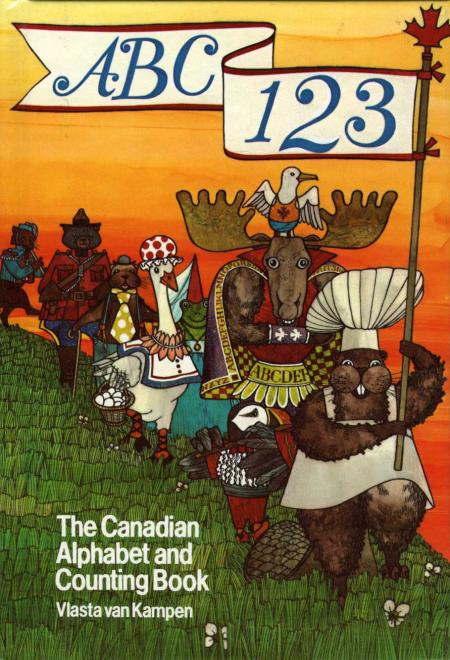
Illustration by Vlasta van Kampen for ABC/123: The Canadian Alphabet and Counting Book
In my last blog I wrote about my favourite of my mom's books ABC/123: The Canadian Alphabet and Counting Book (ABC/123). I was upset because when I went to scan in some images I couldn't find my copy. I have no idea where it has gone but it is nowhere in my house.
It was my mom's birthday this past weekend so our little family gathered to celebrate with excellent food, great beer (thanks Dimitri) and divine wine (thanks Marie). While I was there I mentioned my loss to mom. She took me to her cupboard, dug around in some
boxes and handed me a copy of the book. "You can have this one" she said. I was thrilled. When I opened the front cover I was touched to see that it was the copy she had given to her parents. They have both passed away now. I mentioned this to her and she didn't say much.
 Illustration by Vlasta van Kampen for ABC/123
Looking at the cover I was brought back to my childhood and the house where I grew up. My mom stayed at home to raise us but she somehow managed to keep working – being an illustrator she could work from home.
Before she had children she worked as an in-house illustratorr at the Natural Sciences Company, an off-shoot of McClelland & Stewart. She was hired, along with 2 other illustrators (Gordon McLean and Jerry Kozoriz), to create a technique that would be completely unique but that would be comparable to photography in accuracy. The series they were working on was called The Illustrated Natural History of Canada. All the illustrations fo rthis series had to be approved by Dr. WalterTovell, curator of the department of geology at the Royal Ontario Museum, and Dr. J. Murray Speirs from the Department of Zoology at the University of Toronto.
The technique they developed was quite incredible. How they ever discovered it is still a mystery. Not even my mom can really remember but that might be due to the amount of chemicals involved.
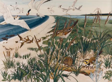
 Illustration by Vlasta van Kampen for Kouchibouguac National Park of Canada
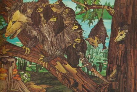
An illustration would be hand drawn, using pen and ink, on illustration board. Filling in the black and white drawing is where the magic happened. Colours and textures were created separately and then cut out using X-Acto knives and adhered to the drawing. Each minute colour shift would be a separate piece of colour.
THE TECHNIQUE: Special "old-school" typographer's transfer film (paper with wax and film) was the substrate on which the colour was created. A polymer mix would be applied to the surface of the film. Various brushes or a hair dryer would be used to mold the polymer into textures reminiscent of rock, sand, feathers, water…. A mixture of designer marker ink and rubber cement thinner (both really stinky) would be brushed on top of the textured polymer and left to dry. The result of this brain cell eliminating process was sheets and sheets of the most beautiful textures in the most brilliantly saturated colours. The plastic, film-like texture could then be carefully cut out, peeled off the paper and burnished onto the illustration board – it would stick due to the wax.
 Illustration by Vlasta van Kampen for The Illustrated Natural History of Canada
This technique was only ever done by these 3 individuals and alas will never be done again due to shifting technologies and obsolete materials. The inks are no longer available since everyone is shifting to less toxic alternatives. The wax-back paper died along with hand set typography.
I look at the cover of ABC/123 and I am transported back to my childhood home. Back into the nook in the extension where my mom continued to use this technique after leaving her full time job to care for her family. Hearing the hairdryer, seeing those colours evolve and not really giving any of it much thought. Now I can appreciate the time, dedication and patience involved in my mom's craft, her art.
The inside of ABC/123 is black and white. One might think that after seeing such a colourful cover it might be disappointing to not have colour inside. The illustrations are so lovely and full of detail and texture that one forgets there is no colour.
Illustration by Vlasta van Kampen for ABC/123 – This ice cream bowl now lives in my cupboard. There is only one left but I cannot throw it away because of this illustration.
ABC/123 won the 1982 Canada Council Award (Now referred to as the Governor General’s Award) - For best illustration in a children’s book in Canada (Hurtig, 1982).
When I went to scan in the illustrations from ABC/123 I looked for the note from my mom to her parents at the front. I couldn't find it. She must have swaped the books before I left for home.
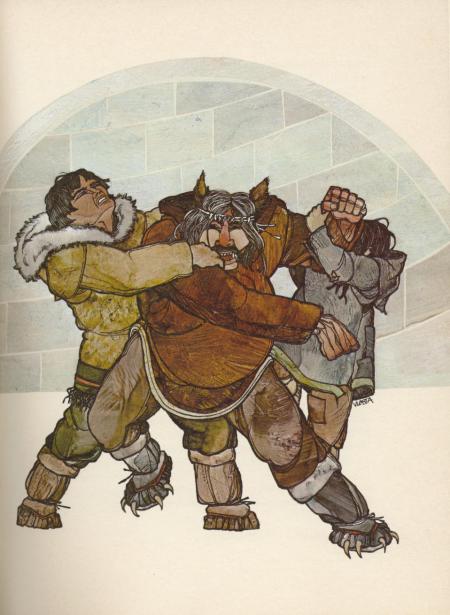
 Illustration by Vlasta van Kampen for Canadiana Books
