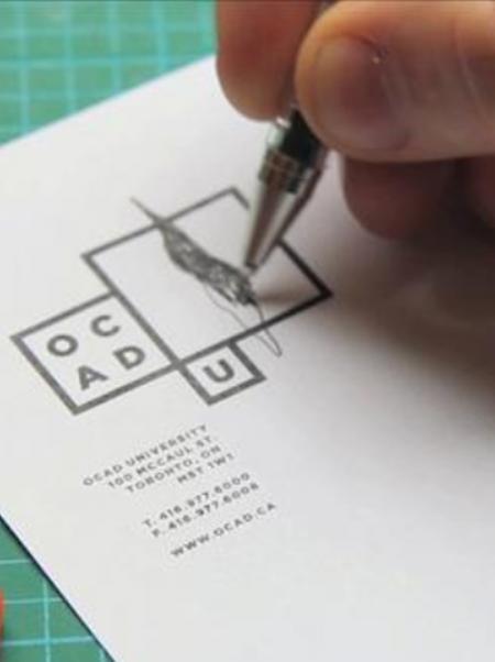
The school has gone through several changes since I have known it, including several logo changes of which none have done the school justice. Until now.
The creative process brought forward by Bruce Mau for the development of this new logo was quite unique. There were open forums where students, alumni and faculty could be a part of the discussion. There were walls in the school dedicated to information gathering. Anyone could write their ideas for the identity and general thoughts about the school on note paper and stick them on the wall. This process was open to everyone.
On first glance the logo seems uninspired and, actually, a little dull. It is only one colour – black – for an art and design school? But it’s the endless possibilities and the unique individuality that has been captured in this truly inspired result.
http://www2.ocad.ca/visualidentity/
–This post was originally written for SOS Design by your truly.


