This blog is where I reflect on creative processes, creative happenings, creative experiences and creative artefacts.
Vernacular Found in Four of Toronto's Neighbourhoods
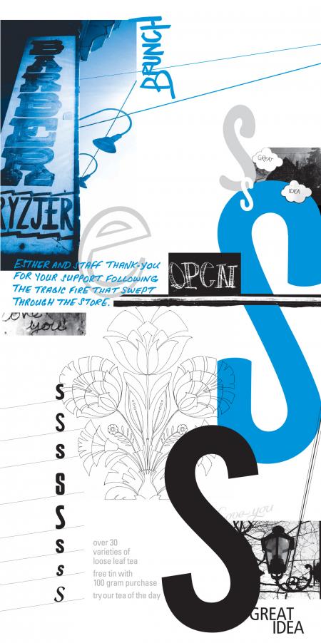 Roncesvailles by Saskia van Kampen
Toronto's vernacular signage is an essential yet ephemeral part of our culture. I have become infatuated with our neighbourhood's hand
drawn signs. This project for Studio 2 with David Cabianca at York University is a documentation of the vernacular design in 4 of Toronto’s neighbourhoods.
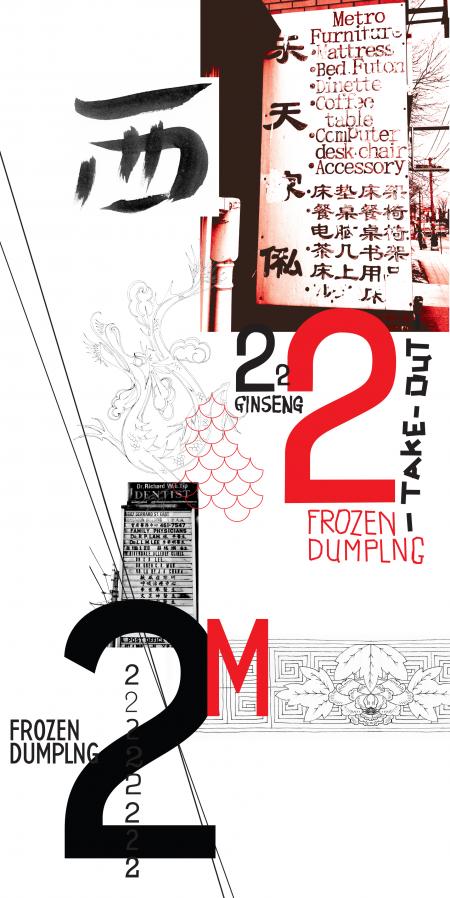 China Town East by Saskia van Kampen
For each neighbourhood I have created a book and poster that capture the vernacular from that specific moment in time. The fact that hand made signage changes from day to day makes it dificult to stop documenting – there is always something new the next day.
 Little Jamaica by Saskia van Kampen
Multivocality is a word which Sojin Kim, Somi Kim used to describe vernacular signage in their essay from the book Lift and Separate. I thought that this was a great way of framing how these images of signs in Toronto uphold the culture within their neighbourhoods.
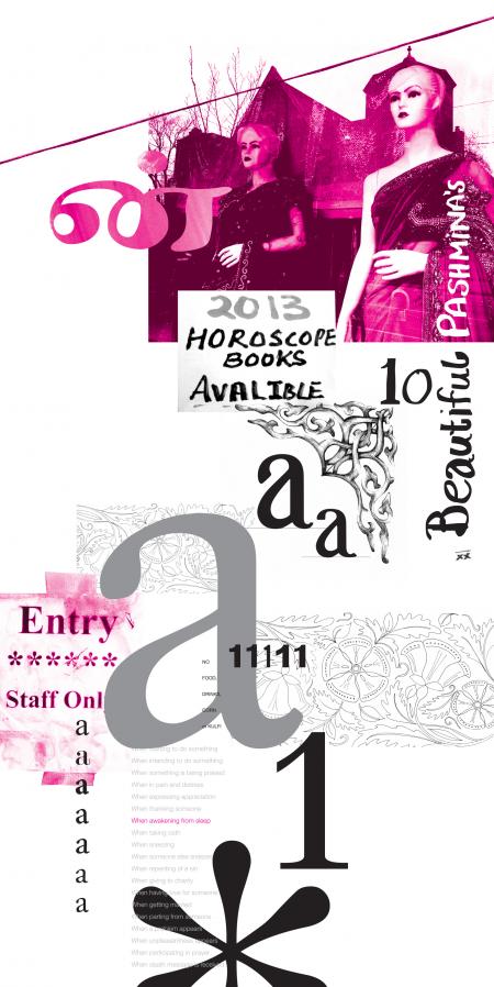 Little India by Saskia van Kampen
The books contain spreads that juxtapose images that contain the original typography with a version of the sign that replaces it with Helvetica. This highlights how vernacular design adds flavour to communities and neighbourhoods. The titles of the four books (DeVoid, DeMote, DePose, DeSign) all speak to this removal.
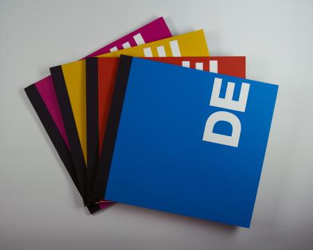
I have visualized the cultural aspect of these neighbourhoods by placing renderings of traditional patterns the interior of the French folds in the book.
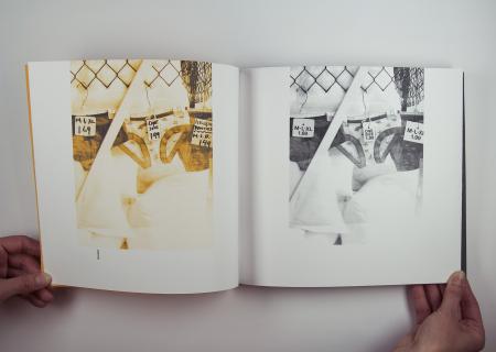 Vernacular Versus Helvetica. Book detail by Saskia van Kampen
This is my second assignment looking at the vernacular in Toronto. Something tells me I need to move on now. BUT... I do hope to continue documenting the vernacular once I get through this Masters program.
